Even word spacing
No stretched lines, no holes, no rivers of white. When a letter shape can take a tiny bit of the slack, it does, so the spaces don't have to.
Book typesetting
Pick up a novel from a big publisher and the pages feel calm. The words sit evenly. Nothing snags your eye. That is typesetting, and it is the part of a self-published book readers notice without knowing why. The Interior Formatter does it for you.
Free to set and read every page. $19.99 for the whole book. No subscription.
The one picture that explains it
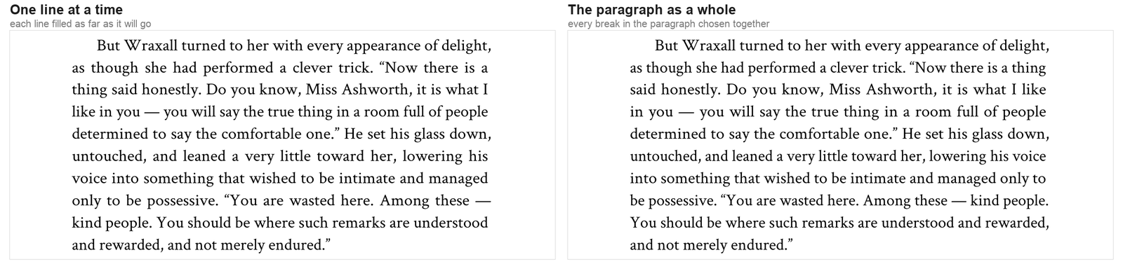
Word, Google Docs and most book tools fill a line until the next word won't fit, then start a new line. When a line comes up short, the spaces between its words get stretched to fill it. Do that a few thousand times and you get holes, and sometimes rivers of white running down the page.
We look at the whole paragraph first and pick all the line breaks together. A line that would have come out loose gets fixed by moving a word on the line above it.
What you will see on your pages
No stretched lines, no holes, no rivers of white. When a letter shape can take a tiny bit of the slack, it does, so the spaces don't have to.
A hyphen now and then is normal in a printed book. A stack of them down the right edge is not. We break a word only when it truly helps, and we look for stacks and take them apart.
A page shouldn't end a line or two early for no reason. We re-set earlier paragraphs to fill it, and if full pages matter most to you, one setting puts them first.
A paragraph never leaves one line stranded at the top or bottom of a page. Widows and orphans are handled for you.
Straight quotes and typed hyphens from your manuscript become proper “quotes” and dashes. Punctuation hangs a hair into the margin so the edge looks straight.
Chapters start on a right-hand page, with drop caps sized to the actual font, and page numbers and running heads left off where they don't belong.
The hyphen problem
Here is the same paragraph set by us, by a leading commercial formatter, and by Microsoft Word at its default settings. Word ends three lines in a row with a hyphen. The other tool hyphenates twice and still leaves wide gaps between words. We need no hyphen at all, and the spacing stays even.

We counted
We set the same full-length novel in Word, in a leading commercial formatter, and in our formatter. Same font, same type size, same line length, so nobody got an easier job. Then we measured every line of all three books.
| In the whole book | MS Word | The other formatter | BookPublish |
|---|---|---|---|
| Pages that fill to the bottom | 54% | 87% | 98.7% |
| Pages with a river of white | 41 | 194 | 3 |
| Lines with a very wide gap | 23 | 204 | 0 |
A river of white is the one flaw every reader has seen, even if they never had a name for it. The other formatter has one on 194 pages of this novel. Word has 41. We have 3.
Your book will not match these numbers exactly, because every manuscript is different. That is why you can set your own and read every page before you pay anything.
Want every page perfect? Choose Flush page bottoms and press Advanced Typeset. It sets your whole book 64 different ways, compares them, and lets you pick the best. On this novel it took 34 seconds on our computer, and every one of its 236 mid-chapter pages filled to the bottom.
You stay in charge
Choose a style (Literary, Modern, Genre, Compact or Classic) and a trim size. The formatter sets the book, then tells you in plain words about anything worth a second look, like a page with a river of white, and often the one word to add or cut that fixes it.
The Interior Formatter is free to use: name your book, bring your manuscript, and it sets real pages you can read before you commit to anything. You only pay when you want the files without the preview watermark.